Time Series
Observations of a variable collected over successive periods of time.
Types include univariate (one variable — e.g. temperature) and multivariate (several variables — e.g. stock open/close/high/low).
Here order matters. In classical statistics, observations are assumed independent. Shuffle the rows and nothing changes. In a time series, shuffling destroys the information.
Yesterday tells us something about today. This dependence is:
- a problem, because many standard methods assume independence;
- an opportunity, because dependence is what makes prediction possible.
Time series patterns
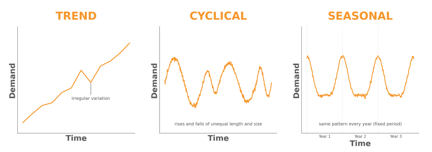
Trend: a long-term increase or decrease.
Seasonality: a pattern repeating at a fixed, known period (day, week, year)
- e.g. Christmas sales week or rental spikes during weekends
Cycle: rises and falls without a fixed period, usually lasting longer than 2 years.
- e.g. irregular multi-year epidemic waves
Seasonality has a fixed period; cycles don’t
Time Series Decomposition: How to get trend and seasonality
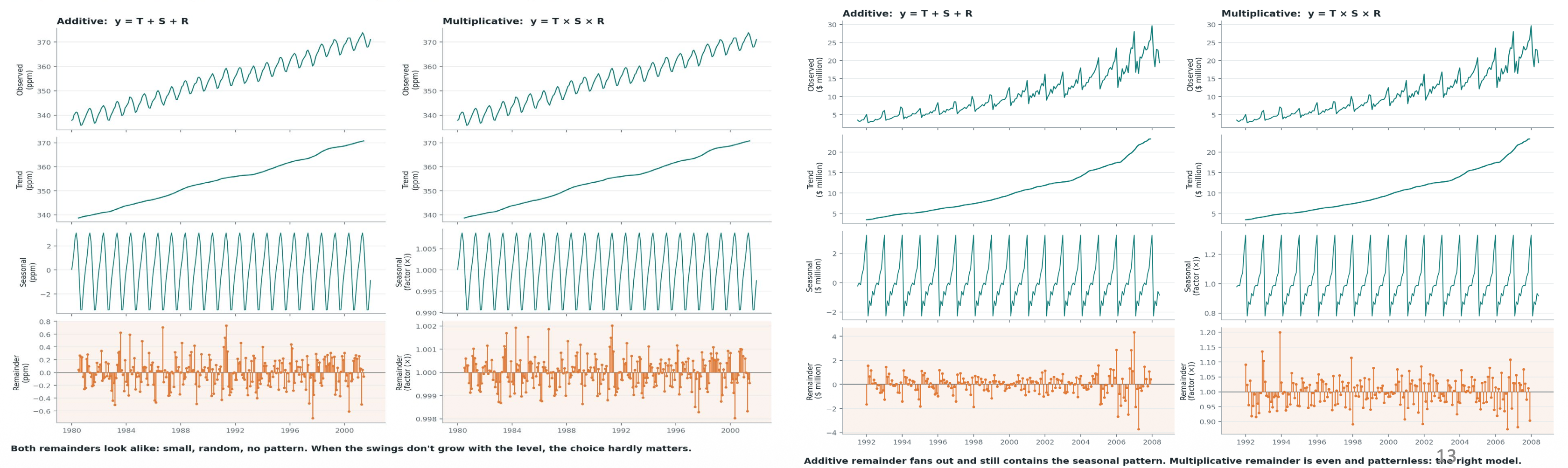
- Additive when the seasonal swings stay the same size
- Multiplicative when they grow with the level.
Correlation
- relative strength of linear relationship
- unit-less
- ranges between
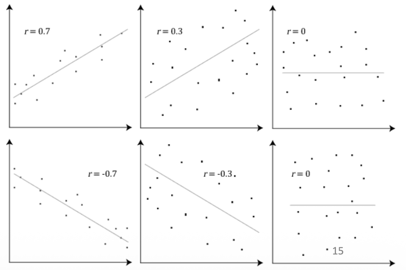
A high value near 1 or -1 means a strong relationship where points form a tight line, making it easy to accurately predict one variable based on the other.
A low value near 0 means a weak relationship with widely scattered points, indicating the variables barely affect one another.
A middle value around 0.5 or -0.5 shows a moderate relationship where a general trend exists, but the points are loose enough that predictions will have noticeable error.
The positive or negative sign simply dictates whether that trend slopes upward or downward.
Lag plot: correlating a series with its own past
basically plot against .
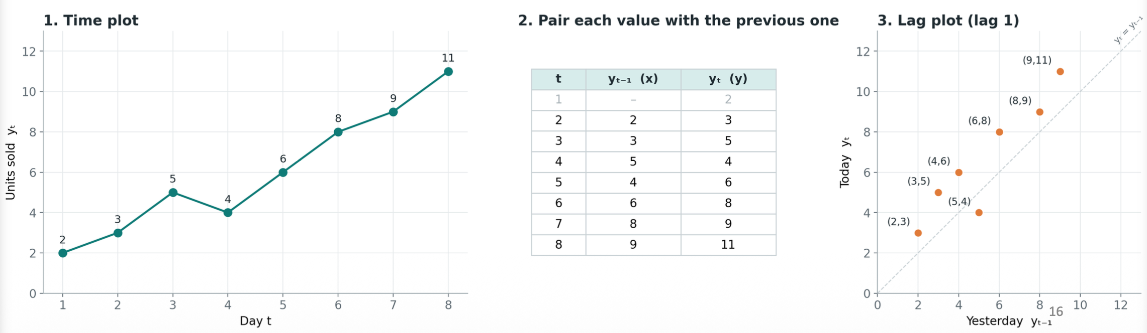
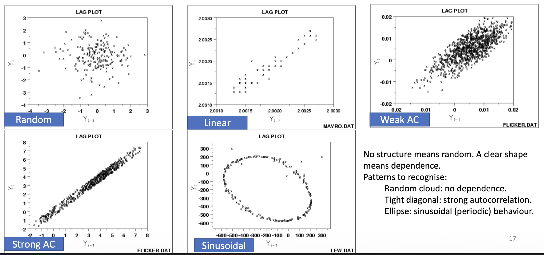
- random cloud: no dependence
- tight diagonal: strong autocorrelation
- ellipse: sinusoidal (periodic) behavior
Autocorrelation
Autocorrelation
it’s the correlation between and its lagged value .
- is the mean
It compares each value to a previous value that is exactly steps back. If the lag , it compares each value to its immediate predecessor. If , it compares each value to the one two steps before it.
The ACF (correlogram) plots against lag .
- The dashed blue lines represent a 95% confidence threshold where correlations inside the lines (grey bars) might just be random noise, while those outside the lines (orange bars) indicate a statistically significant relationship.
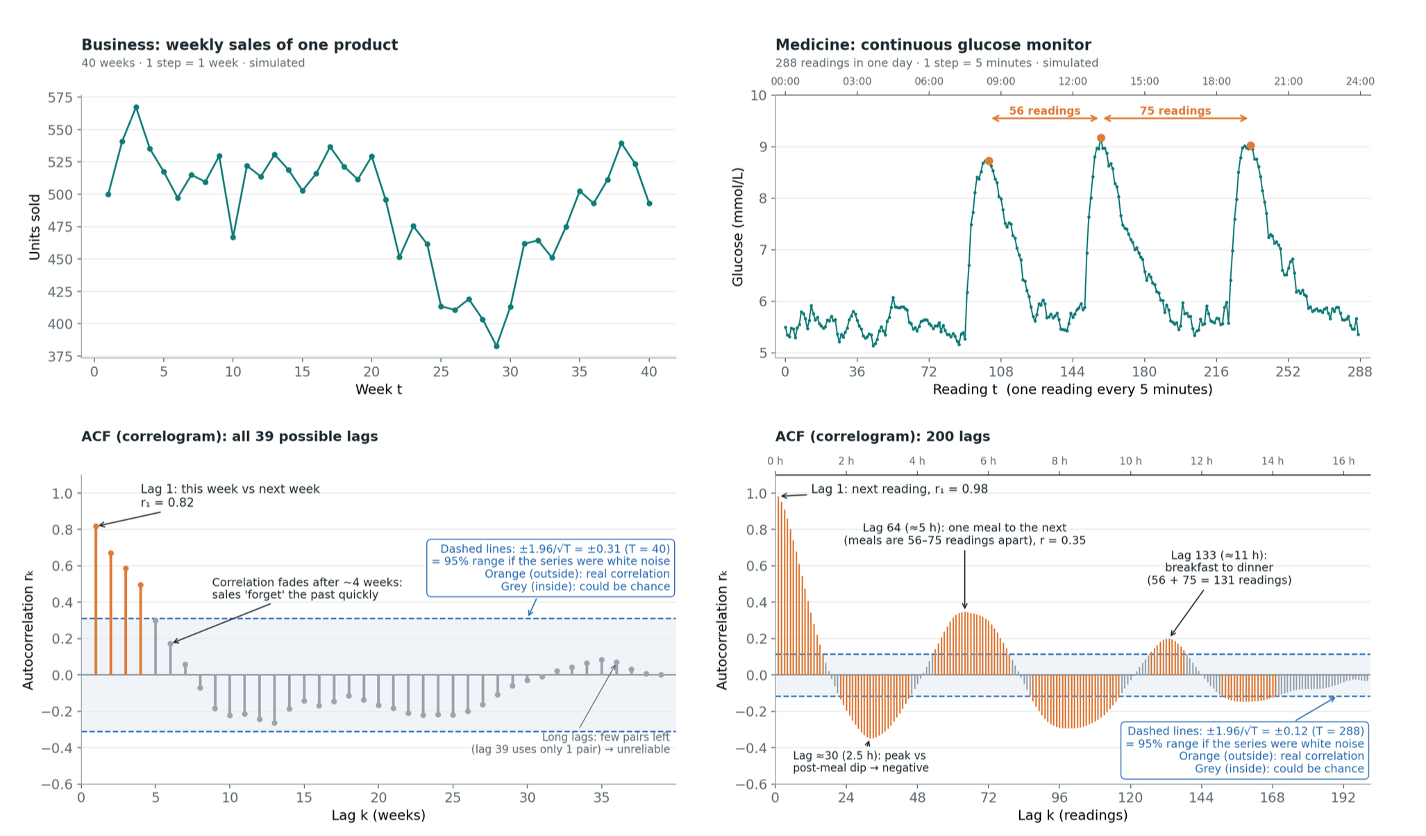
- In the business sales data on the left, the ACF drops rapidly, showing strong positive correlation only for the first four weeks before fading into the grey zone. This indicates the sales data has short-term “memory” and lacks long-term repeating cycles
- the continuous glucose monitor data on the right produces a wavy ACF plot characteristic of cyclical or seasonal data. The positive peaks at lags 64 and 133 correspond to repeating intervals between meals, while the deep negative trough around lag 30 captures the inverse relationship between a high glucose peak and the subsequent post-meal dip 2.5 hours later.
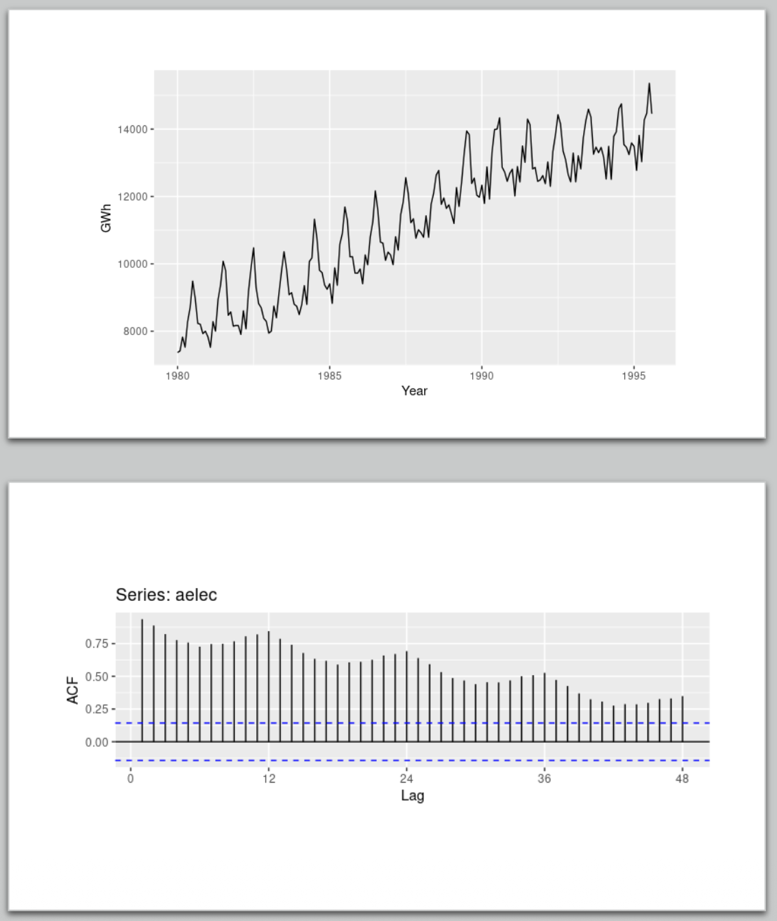
The slide explains how to identify trends and seasonal cycles in a time series using an autocorrelation plot?
Data with a long-term trend will show large, positive autocorrelations for small lags that slowly decay as the lag increases.
Data with seasonal patterns will show distinct peaks in the autocorrelation at regular multiples of that seasonal frequency
White noise
White Noise
a series with no autocorrelation, mean zero and constant variance.
i.e. “nothing left to learn” benchmark.
- in ACF terms, of spikes lie within
- is the series length.
- i.e. the dashed blue lines
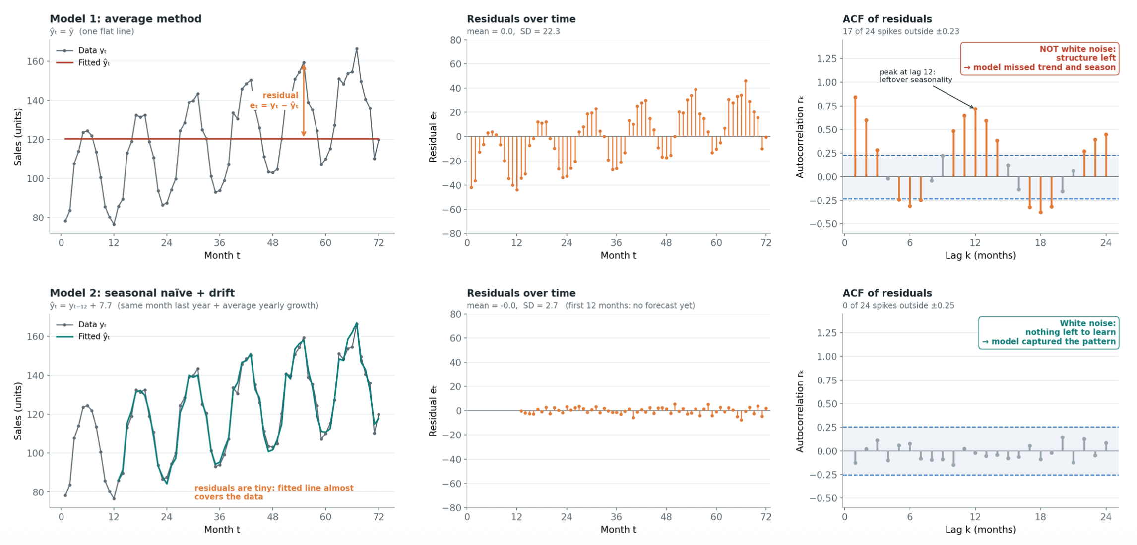
- many spikes outside the bands mean the series still has structure left.
The goal of modelling is to capture all the structure so that only white noise remains. If model residuals are still autocorrelated, the model has missed something.
What is a residual?
The part of the data the model did not explain .
Good residuals are uncorrelated (the ACF looks like white noise) and have mean zero (otherwise the forecasts are biased).
Some nice to have’s include (i) constant variance, (ii) approximately normal distribution, which is needed for prediction intervals.
The random walk
Today equals yesterday plus a random step: . The spread grows over time, so the mean and variance are not stable.
Think of a random walk as adding up independent random steps — if the variance of a single step is , the total variance after steps equals . The standard deviation is the square root of the total variance, resulting in . The envelope formula simply represents a standard 95% confidence interval, spanning roughly two standard deviations above and below the center to capture where the vast majority of random paths will fall.
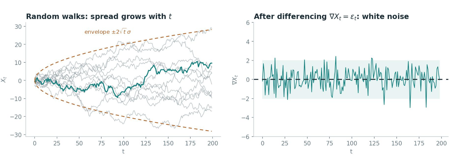
- Stock prices are a classic example. In this case, the naive forecast is optimal.
Forecasting methods
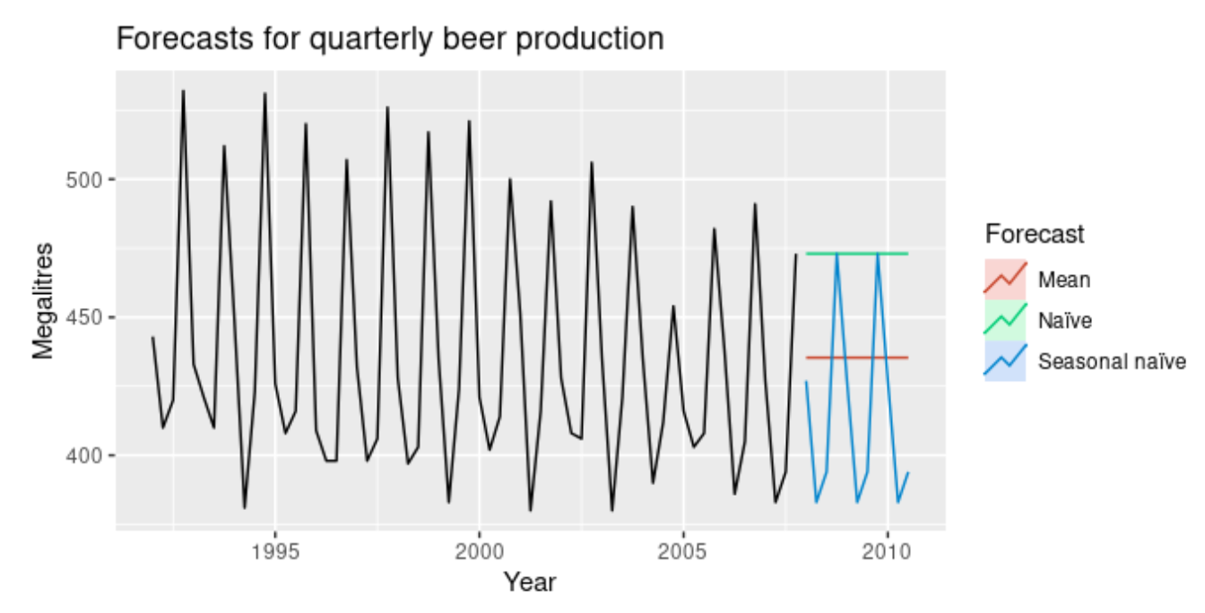
- Average method: the forecast of all future values are equal to the average
- (i.e. assign the mean of the data to the incoming observation)
- Naïve method: forecast is the last observed value
- (i.e. assign the last value we have to the incoming observation)
- Seasonal naïve method: last observed value from the same season
- predicts future values by simply copying the last observed value from the corresponding season
- Drift method: Naïve + average change in data
Seasonal naïve captures the pattern; average and naïve miss it.
Forecasting accuracy
- Both are in the units of the data, so they are interpretable
- RMSE penalises large errors more
- Use it when big misses are costly: a stock-out, or an unexpected surge in patients
Cross validation
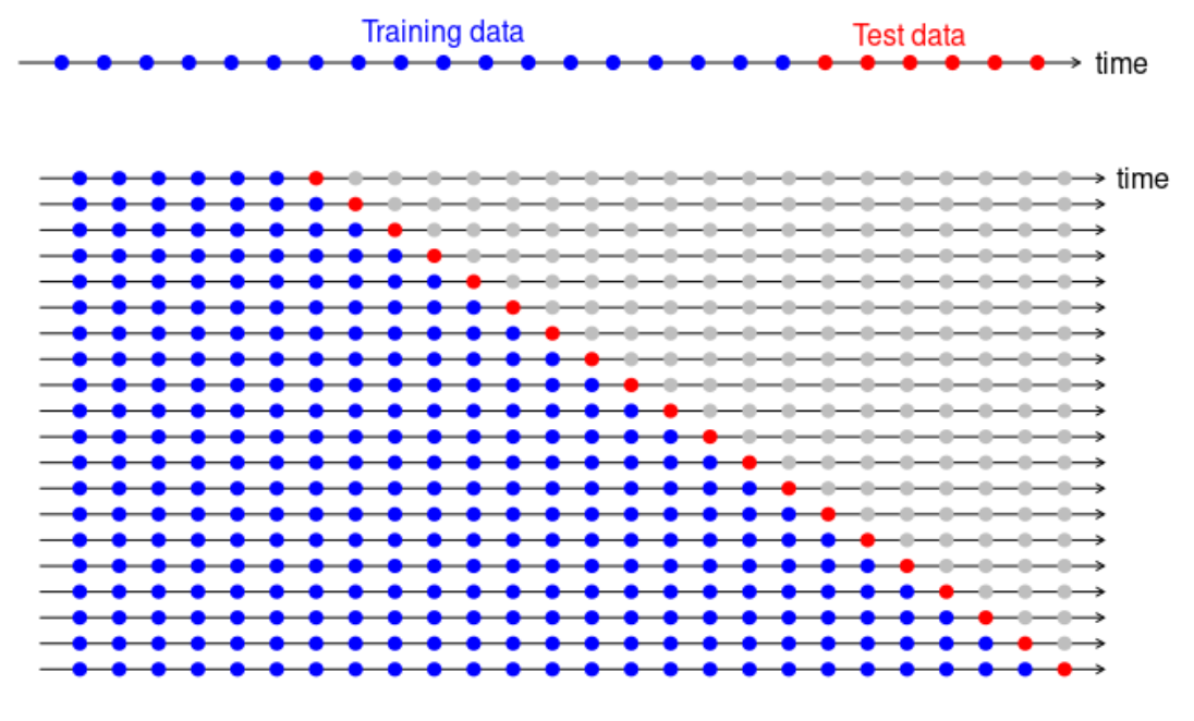
- Never shuffle a time series.
- Training data comes first; test data is the most recent part.
- Evaluate only on data the model has not seen.
- The test set should be at least as long as the horizon you want to forecast.
Stationary and Non-Stationary Time Series
A stationary series has statistical properties (mean, variance, autocorrelation) that don’t depend on when you observe it. An easy method would be to split the series into parts and compare the means, variances and ACFs.
- The ACF drops quickly for a stationary series and decays slowly for a non-stationary one.
Not stationary:
- series with a trend
- series with seasonality
- series with changing variance
Stationary:
- white noise
cycles without a fixed period can still be stationary (the lynx series)
Which of these are stationary?
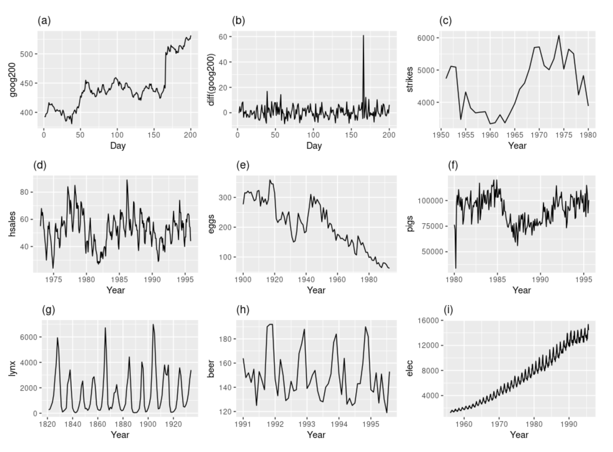
Stationary: (b), (d), (g)
- (b): The differenced series hovers around 0 with constant variance, and the one spike is an outlier rather than a trend. Differencing turned the non-stationary (a) into a stationary series.
- (d): It has a constant mean and variance. The apparent seasonality is weak and irregular.
- (g) lynx: The cycles are strong, but they have irregular periods (not a fixed seasonal length), so the series is stationary. Cyclic behavior with no predictable timing doesn’t violate stationarity.
- lynx = irregular boom-bust cycles around a stable average
Non-stationary:
- (a): Clear trend, and the level shifts.
- (c): Mean changes over time, with a trend-like swing.
- (e): Downward trend.
- (f): The mean shifts over time, and the early drop around 1980 is a level change.
- (h): Fixed-period seasonality (repeats every year), which makes it non-stationary.
- (i): Upward trend, growing seasonal amplitude, and increasing variance.
To make a time series stationary
- apply differencing — it stabilizes the mean. Doesn’t matter if first or seasonal differencing.
- Log or root (Box-Cox) transforms stabilize the variance.
- Transformations can be combined, e.g. log first, then difference.
Time Series Modelling
AutoRegression () — regression with itself (it’s a regression of the series on its own past values)
- is the order
- is a constant
- are the parameters
For to be stationary, . If is exactly 1, the model turns into a random walk where the variance grows endlessly, and if its magnitude is greater than 1, the series will exponentially explode toward infinity.
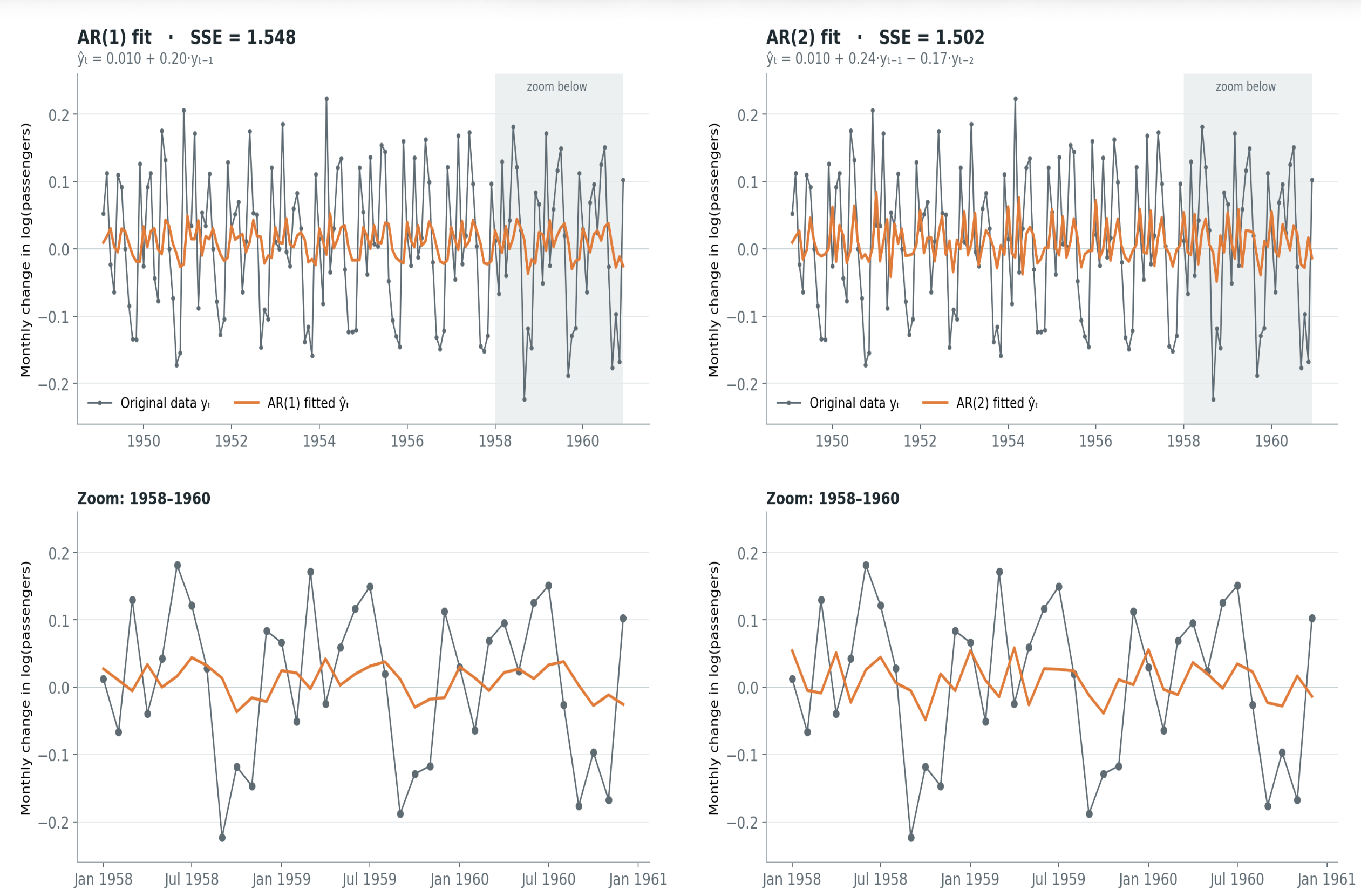
A higher order allows the model to capture more complex, long-lasting patterns in the data, but it increases the risk of overfitting (high variance) by essentially memorizing random noise from too many past steps. A lower order keeps the model simple and mathematically stable, but it risks underfitting (high bias) by ignoring important historical context.
Moving Average () — make decision based on previous errors instead of previous values.
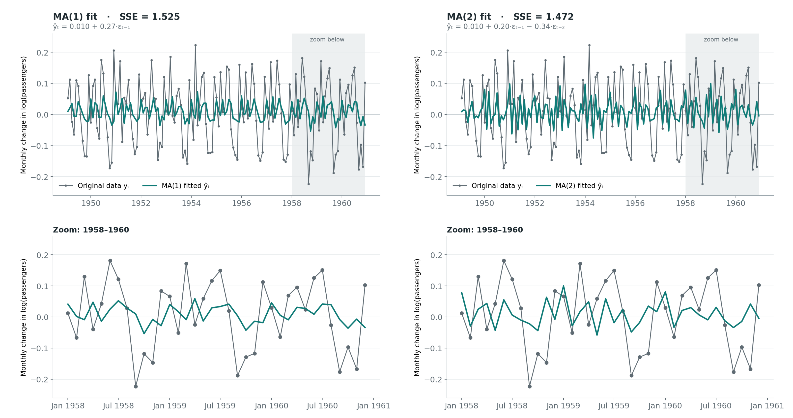
An MA(q) model is inherently stationary regardless of its parameters because it is mathematically just a finite sum of stable white noise.
ARMA and ARIMA
: both pieces summed up
: an ARMA model on the series differenced times. ARMA assumes stationarity, so ARIMA first differences the series d times, then fits ARMA on the result (look back to images (a) and (b)).
Choosing and :
- PACF cuts off after lag p AR(p)
- “Cuts off after lag k” means that on the ACF/PACF plot, the bars at lags 1 through are significant (stick out past the blue confidence band), and every bar after lag drops to roughly zero (stays inside the band).
- ACF cuts off after lag q MA(q)
- Or grid search over and pick the lowest AICc
Link to benchmarks:
- = random walk = naïve forecast (tomorrow = today). This is .
- = drift forecast (naïve plus a steady trend)
| Model | ACF | PACF |
|---|---|---|
| decays gradually | cuts off after lag p | |
| cuts off after lag q | decays gradually |
page 36.